
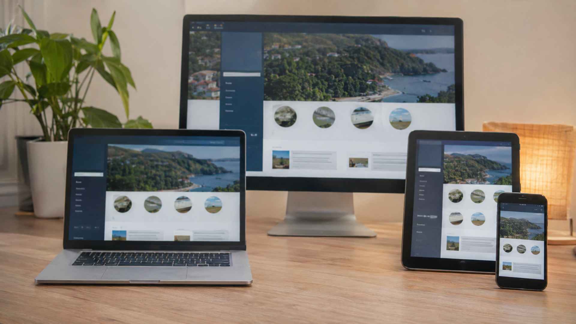
Responsive website layouts for small screens have become an important part of modern web design. Many people now access websites through smartphones and tablets, making it essential for websites to display content properly on different screen sizes. A layout that looks attractive on a desktop may become difficult to use on a smaller device if its elements are not adjusted correctly. Text can appear too small, images may overflow, and navigation menus can become confusing. Responsive design helps prevent these problems by allowing website elements to adjust naturally to the available screen space.
Creating a mobile friendly layout is not simply about making everything smaller. It involves arranging content, adjusting spacing, improving readability, and making navigation easier for visitors. A well designed responsive website provides a consistent browsing experience while keeping important information accessible. By understanding a few practical design principles, website owners and developers can create layouts that work smoothly across different devices.
Understanding How Responsive Layouts Work on Small Screens
Responsive web design allows a website to adapt its appearance and structure based on the screen size and capabilities of the device being used. Instead of creating separate websites for desktop and mobile users, developers can use flexible layouts, CSS media queries, and scalable elements to support different screen dimensions. These techniques help content fit naturally without requiring visitors to zoom in or scroll horizontally. The viewport meta tag is also important because it tells mobile browsers how to display the page according to the device’s actual screen width.
A responsive layout usually starts with a flexible grid that adjusts as the available space changes. For example, a desktop page might display three content columns, while the same content appears in a single column on a smartphone. Images can also scale within their containers to avoid extending beyond the screen. CSS properties such as max width: 100% help keep images within their available space. These adjustments make websites easier to browse and reduce unnecessary layout problems on smaller devices.
Key Design Elements That Improve Mobile Website Layouts
Readable typography is one of the most important elements of a mobile friendly website. Visitors should be able to read paragraphs, headings, and navigation labels without constantly zooming in. Using an appropriate font size, comfortable line height, and clear contrast can make content easier to understand. Designers should also avoid placing too much text in narrow areas because extremely long lines or tightly packed paragraphs can make reading uncomfortable. A consistent typography system helps maintain a clean appearance across different screen sizes.
Navigation also needs special attention when designing for smartphones. Desktop websites often have wide navigation bars with several menu items, but these can take up too much space on smaller screens. A compact navigation menu, such as a hamburger menu, can provide access to important pages without crowding the layout. Buttons and interactive elements should have enough space around them so visitors can tap the correct option easily. Keeping navigation labels simple and arranging menu items logically can also help users find information faster.
Practical Ways to Create Better Responsive Website Layouts
A mobile first approach is a useful starting point when building responsive websites. This method focuses on designing for smaller screens before adding features and layout improvements for larger devices. Developers can begin with the most important content, such as page headings, text, images, and primary navigation. Once the mobile layout works properly, additional columns, wider spacing, and more complex elements can be introduced for tablets and desktop screens. This approach helps prevent unnecessary design elements from making mobile pages difficult to use.
Testing across different screen sizes is another important part of responsive website development. A layout that works well on one smartphone may not look the same on another device because screen dimensions, browser behavior, and display settings can vary. Browser developer tools make it possible to preview websites at different viewport widths without needing every physical device. However, testing on actual smartphones and tablets is still useful for checking touch interactions, text readability, loading behavior, and navigation. Developers should also check whether images, forms, and other page elements remain within the screen boundaries.
Website performance should not be overlooked when improving layouts for small screens. Large images, unnecessary scripts, and excessive design effects can increase loading times, particularly when visitors use slower mobile connections. Optimizing image dimensions, choosing suitable file formats, and loading non essential images when needed can help reduce unnecessary data usage. Developers can also minimize unused CSS and JavaScript to keep pages more efficient. Performance improvements are important because visitors may leave a website when pages take too long to load.