
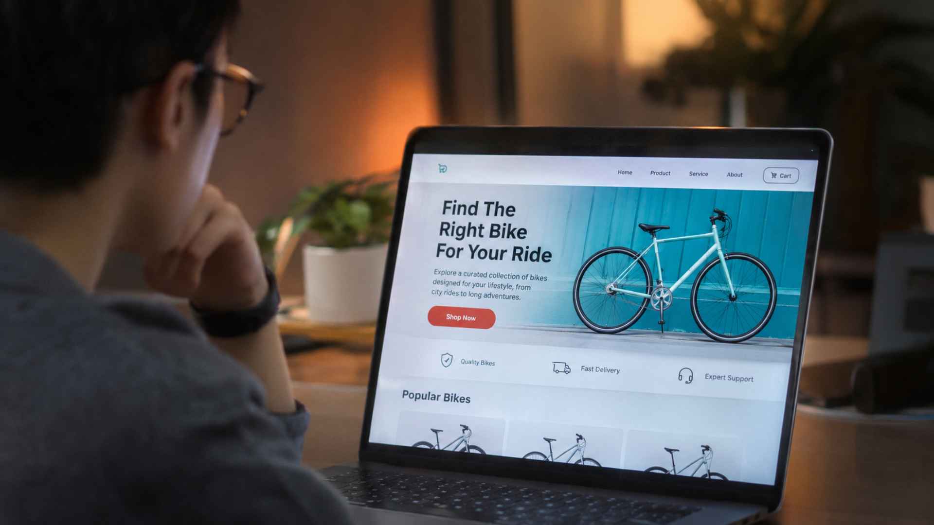
Website visitors make decisions while processing a large amount of visual information. Text, images, navigation menus, advertisements, and interactive elements compete for attention within a limited screen area. Their arrangement affects which information people notice first, which details they overlook, and whether they can locate the material needed to complete a task.
Visual hierarchy refers to the organization of page elements according to their relative importance. Designers create this hierarchy through size, contrast, spacing, alignment, position, and typography. Clear distinctions help visitors recognize headings, supporting information, and available actions. When several elements compete equally for attention, the page can feel difficult to interpret despite containing useful information.
Research in usability and interface design supports the importance of visual organization. Nielsen Norman Group identifies contrast, scale, and grouping as major contributors to visual hierarchy. These principles reflect the way people perceive relationships between objects on a page. Effective hierarchy should therefore support both readability and task completion rather than serve as decoration alone.
Contrast, Typography, and Attention
Contrast helps distinguish important information from surrounding content. Headlines generally receive stronger visual emphasis than body text, while supporting descriptions appear less prominent. Typography also communicates structure through weight, size, and spacing. These differences should remain consistent so visitors can recognize similar types of information across multiple pages without repeatedly interpreting unfamiliar layouts.
Color can influence attention, but contrast matters more than choosing a particular fashionable shade. Text must remain readable against its background, including for visitors with reduced vision or color perception differences. Accessibility standards provide measurable contrast recommendations for many text elements. Design decisions that improve legibility often make information easier to use across a wider audience.
Layout Patterns and Visitor Expectations
People approach websites with expectations developed through previous online experiences. Navigation menus, product information, contact details, and search functions are generally easier to locate when their placement follows recognizable conventions. Unusual layouts can be appropriate for creative purposes, but they may introduce unnecessary effort when visitors simply want practical information.
Spacing and grouping also affect interpretation. Elements positioned close together are often perceived as related, while greater separation suggests different sections or purposes. Cards, headings, and content blocks can establish meaningful relationships when used consistently. Poor grouping may cause visitors to associate unrelated information or overlook important conditions attached to a product, service, or action.
Decision Clarity Across Desktop and Mobile Screens
Mobile interfaces place additional pressure on visual hierarchy because screen space is limited. Large images, excessive introductory text, and competing buttons may push relevant information beyond the initial viewport. Responsive layouts need to preserve the order of important content while adapting navigation and interactive elements to smaller screens.
Calls to action should reflect the actual decisions available to visitors. Clear button labels communicate expected outcomes more effectively than vague instructions. Supporting details such as prices, eligibility conditions, or delivery limitations should remain visible when relevant to a decision. Hiding important information while emphasizing one prominent button can reduce transparency and damage user confidence.
Website performance should be assessed through actual visitor tasks, accessibility reviews, and behavior data rather than appearance alone. Usability testing can reveal whether people notice important information and complete intended actions. Effective visual hierarchy gives visitors a clear route through relevant content, helping them make informed choices without unnecessary distraction or confusion.